Context
After I was diagnosed with Multiple Sclerosis, I joined several communities for discussion of pharmaceutical products. In these groups I found many patients experienced side effects that weren’t listed on the prescribing data for those medications.
In many cases these patients expressed their healthcare providers dismissing their concerns, citing a lack of support from the prescribing data. After speaking with my healthcare providers, it was evident that for newer drugs, prescribing data for medications is often incomplete.
The Problem
“How might we help better facilitate conversations between healthcare providers and their patients?”
Patients express hesitancy discussing their experiences with their physicians, and most physicians express their desire that patients feel comfortable coming to them with their concerns.
The Solution
affirmRX is an application for aggregating a wide variety of reliable pharmaceutical databases, simplifying medication research and providing patients with a simple but robust resource that enables them to confidently present their findings to their physician.
My Role
As a student UX/UI designer, my role was conducting research, user interviews, prototyping, development, branding, design and testing throughout the entirety of this project.
Secondary Research
After seeing communication in a variety of groups online, I first wanted to learn more about patients' experiences. Some findings substantiated my concerns, while others broadened the scope. For this secondary research topics ranged from patient experiences, to healthcare provider concerns including regulatory concerns and beyond.
In one study with statin drugs, physicians were shown to deny a correlation to patient side effects a majority of the time, even if these side-effects were well-documented. (Beatrice A Golomb, John J McGraw, Marcella A Evans, Joel E Dimsdale. 2007. “Physician Response to Patient Reports of Adverse Drug Effects: Implications for Patient-Targeted Adverse Effect Surveillance” https://pubmed.ncbi.nlm.nih.gov/17696579/)
Other resources showed physician concerns that too many drugs are being approved, and that they don’t know all of the side effects for medications they prescribe, even if documented in prescribing data. (Robert M. Kaplan. 2019. “Is the 21st Century Cures Act a Solution or a Problem?” https://www.theregreview.org/2019/05/07/kaplan-21st-century-cures-act/)
For newer medications, there can be an issue of “Postmarket adverse drug reactions”, where efficacy of medication is measured during pre-approval trials, but the nature and extent of side effects are not fully apparent until after a drug reaches market. In these cases it can be difficult for doctors to recognize when side effects are related to a medication. (Eran Klein, MD, PhD and Dennis Bourdette, MD. 2013. “Postmarketing adverse drug reactions” https://www.ncbi.nlm.nih.gov/pmc/articles/PMC3787113/)
This qualitative exploratory study covers patient concerns about using the internet for self care and research, patient and physician communication, as well as facilitation of communication with doctors about patient searches for health information. (Michelle Pannor Silver, BA, BS, MPP, PhD. 2015. “Patient Perspectives on Online Health information and Communication With Doctors: A Qualitative Study of Patients 50 Years Old and Over” https://www.ncbi.nlm.nih.gov/pmc/articles/PMC4319073/)
By the completion of this research I had compiled a list of twenty five studies and articles, which can be found here: https://tinyurl.com/3jrpzpn3.
Comparative Analysis of Competition
I wanted to know what other applications existed in this space, and what features they provided. While no one had the same search filter options, there were several medical applications that covered side effects and interactions. Some of those I reviewed included WebMD, Drugs.com, Medscape and Medisafe.




While all of these applications had search tools, none of them cross referenced external sources, data was generally limited to essential prescribing data alone, and account preferences were limited and didn’t include exclusionary criteria for searches or customization. Another resource, Epocrates, provided substantially more in-depth data than others, but presented possible challenges with language and accessibility.
User Interviews (Exploratory)
In order to determine patient needs, concerns and preferences, I began primary research with user interviews. Data from the Mayo Clinic shows that almost 70% of Americans take at least one prescription medication, so the target demographic of “people taking a prescription medication” would be broad.
Interviewing seven users/patients allowed me to ask for more detailed feedback about these patients' individual struggles and concerns with their healthcare. The findings were consistent with those documented prior, but offered deeper insights, such as a high level of trust in healthcare providers, and a desire to maintain a positive relationship with these care providers.
Research Questions
How do people become aware of potential side effects for prescriptions/what resources?
Why do people feel uncomfortable approaching their doctors with concerns?
What would help people be comfortable starting a dialogue with their healthcare provider?
Why might doctors be uncomfortable with patients seeking information on their own?
What can help healthcare providers be more open when approached with this information?
Interview Insights
Most patients expressed that they consider their healthcare providers and pharmacists to be the most reliable sources of information.
Many patients will avoid discussing their side effects with their healthcare providers if they’re uncertain of their doctor’s response.
Patients expressed discomfort searching online for medication information, and uncertainty in the quality of information they find.
Some patients expressed a desire to limit the amount of information they find on prescription products. Reasons varied from fear of experiencing new side effects, but time constraints and not understanding the information or feeling overwhelmed.
Affinity Maps
In order to narrow down user needs, I reviewed recurring themes, concerns and pain points of the interviewed patients.
Patients expressed a wide range of trust between physicians and the internet. Some patients expressed very high faith in their providers, confidence in their advice, and felt their physicians spent adequate amounts of time with them. Some with a high degree of confidence in healthcare professionals also expressed high trust in their pharmacists, nurses, and the healthcare system overall.
Others expressed they were concerned about being judged by their healthcare providers, that their doctors were dismissive or wouldn’t investigate their concerns. A couple felt that doctors didn’t spend much time with them, or that they didn’t have enough empathy. Some felt that their doctors weren’t open to conversations with them at all, and expressed a concern that they couldn’t discern their physicians qualifications, or whether or not they had adequate continued education after graduating medical school.
Three major themes emerged: those that prefer speaking to their healthcare providers about medical concerns over the internet, those that prefer the internet, and a group that prefers researching online and then bringing the information they’ve found to their healthcare providers.
Empathy Maps
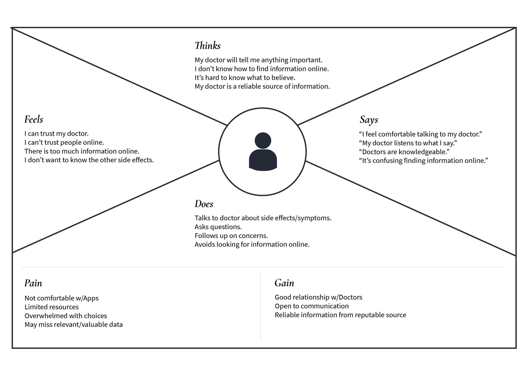
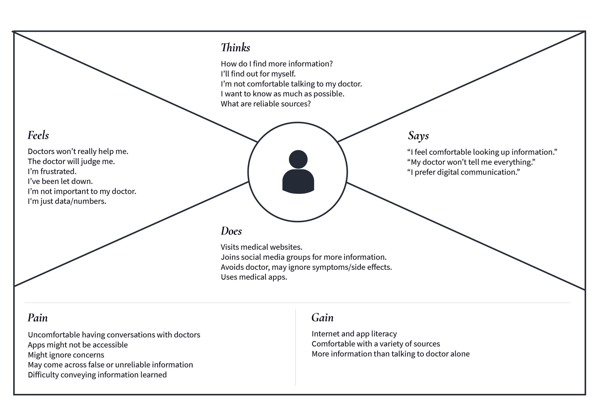
I created empathy maps, focusing on key concerns and themes to help organize the data to narrow down the needs of the target users.
Prefers Doctor: These are patients who trust their physicians, but don’t feel comfortable with or have a low level of trust in what they can find online. They have a positive relationship with their physicians, are more open to direct communication, and most if not all of their information would be obtained through a professional. These patients were more often uncomfortable with applications, may have access to limited resources, can be overwhelmed with information or choices, and might miss information that would be valuable to them.
Prefers Internet: Users who prefer searching online over speaking to their healthcare provider. These patients may feel they cannot trust their physicians, but have a high level of trust in online resources. They may have access to a wide variety of information, and can be comfortable with a broader range of resources. They generally have higher application/internet literacy. Simultaneously, they can be uncomfortable discussing their findings with their physicians, more prone to ignoring health concerns, may find false or unreliable information, and when they do communicate with physicians, have expressed increased difficulty doing so.
Mixed Resources: These patients feel comfortable searching for information online, but also have a high level of trust with their healthcare providers. These patients have the broadest access to information, are more likely to check information for reliability, and generally expressed a greater degree of proactivity in their healthcare choices. These patients express mixed experiences sharing the information they’ve found with their physicians, worries that their physicians may criticize them for using “Doctor Google”, and are still at a higher risk for coming across false or misleading information.
User Flows
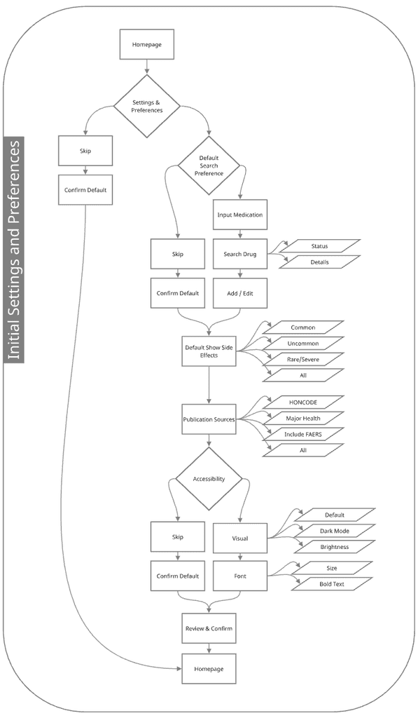
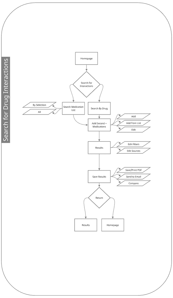
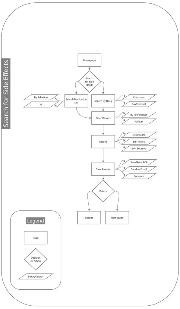
In order to facilitate the users, I had to consider what their journey through the application might look like. What were the most important routes that a user may follow? In this case the filtered searches as well as onboarding portion where users could determine their preferences seemed to be the highest priority.
Sketching and Interactive Wireframes
Based on the user flow, as well as existing standards determined by the healthcare community, I went through a few iterations of sketches, considering how the application should roughly function, what features were necessary, what features may be confusing to users. Below are my final rough sketches.
The low fidelity wireframes helped further determine layout, establish scaling, what functionality would work and what needed correction. The biggest adjustment at this stage was the home screen, particularly with consideration for helping the navigation feel less cluttered and overwhelming.
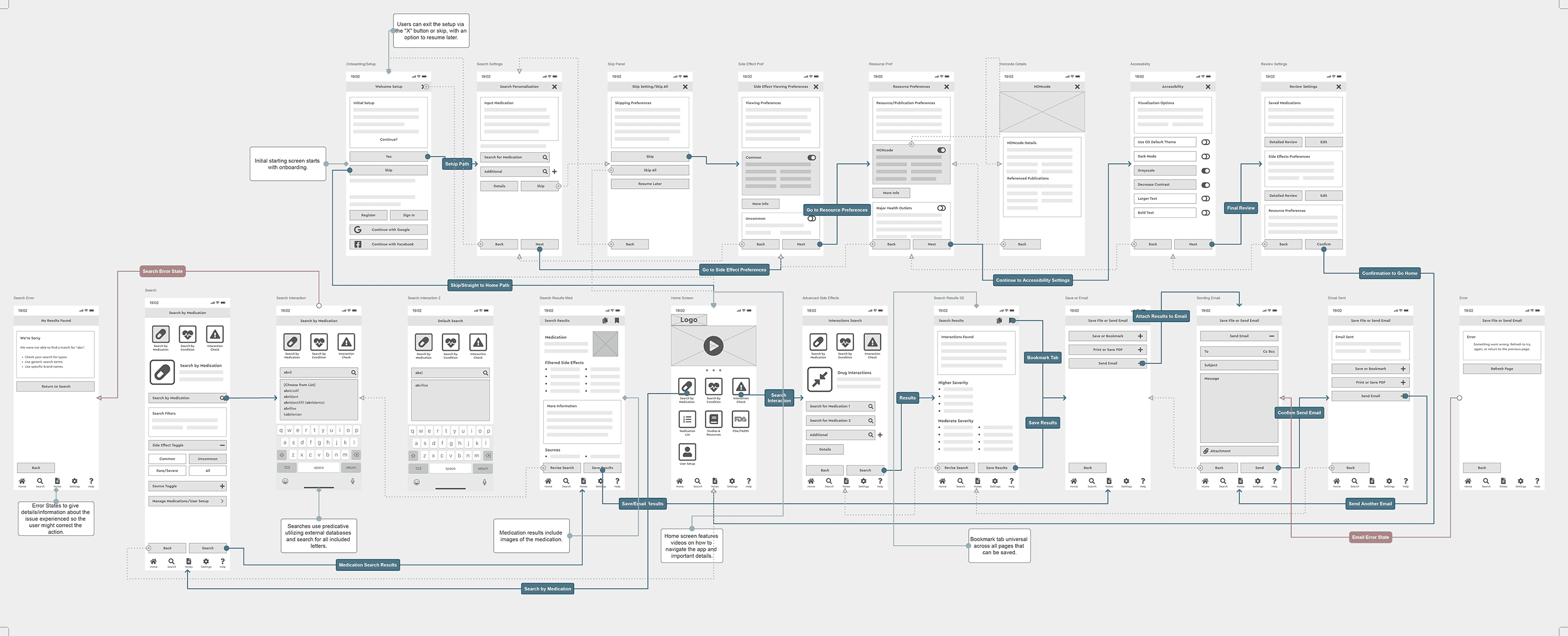
Wireflows
From the low fidelity wireframes (above), the wireflows (below) helped further dial-in navigation and understand what was and wasn’t working. (Draggable image.)
UI & Style
As a healthcare related application, it was important to keep in mind the reasons standards exist. For brand attributes there was emphasis on reliability, caring, sincerity and professionalism.

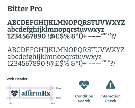
The final color palette is monochromatic desaturated green-blue tone, as blue is most often used in healthcare for being “calming” and “bringing a sense of tranquility”. For the primary text typeface I chose the font Bitter, a contemporary slab serif typeface specifically developed for legibility on-screens. The logo was designed with the heartbeat icon and Playfair Display typography for a sense of warmth and erudition. From here the high fidelity wireframe became the basis for the prototype.
Prototype

Home Page
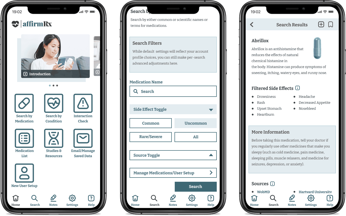
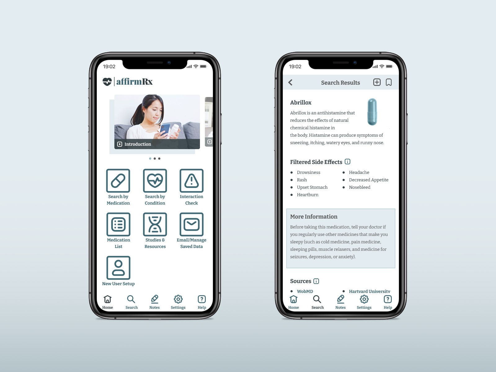
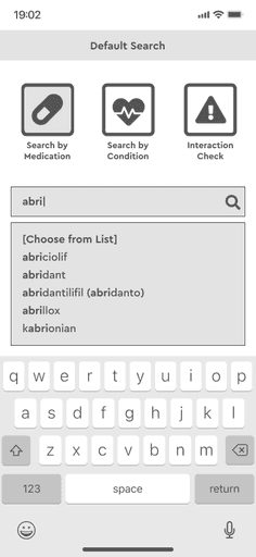
Minimal interface following similar industry conventions.
Streamlined icons for navigation to different components of the application.
Video carousel with tutorials and clarification for users who may be less familiar with navigating healthcare applications.
Focus on user accessibility with options including larger and/or bold text, different modes for color vision deficiency, dark mode.
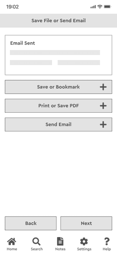
Options for saving/sharing information.
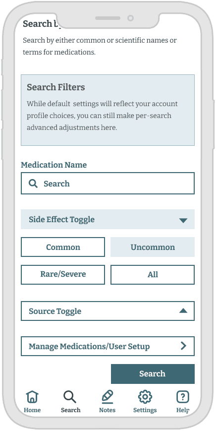
Filtered/Customizable Search
Toggles to allow user control over side effect viewing and medical resources.
Initial user setup can determine and filter all results in perpetuity.
Individual searches can be altered for a per-instance experience.
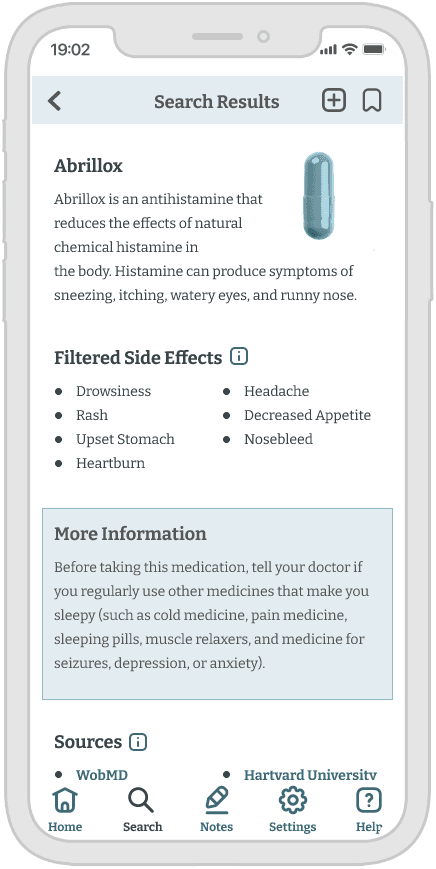
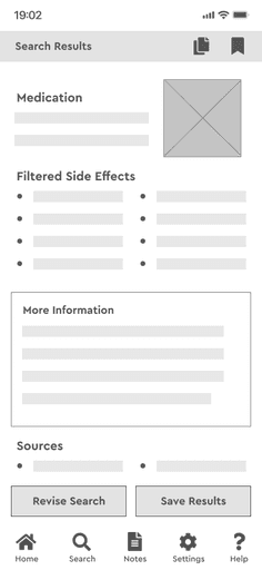
Search Results
User determines in setup which sources and specific range of side effects they would prefer to view.
Aggregate data can come from all available sources, or those specified by the user if they find some resources unreliable or inaccessible.
Sources could be expanded to show which information comes specifically from which resources
Link to Figma prototype: https://tinyurl.com/5n9ynpd2
Validation
I conducted two rounds of usability testing, the second round accounting for issues users experienced during the first round. Both rounds of testing included five users, with the criteria that they be patients who are currently taking, or have taken medications in the past.
First Round of Testing
During the first round of testing, all users understood the basic premise of the application. None had anticipated the communication features from appearances, nor did they attempt to navigate to “share” their findings. One user who navigated to the screen that would allow them to email their findings to their doctor, appreciated the option to email themselves the data so they could more easily access it outside of the application. “If I want to email that to myself because I don’t have a lot of time to look at things, yeah, I like that. I like that a lot.”
All were able to navigate appropriately according to the scenarios I had created, with the exception of one user wanting to add medications to their profile via the medications tab. All but one of the users understood the icons with reference to their main menu counterparts, and could correlate the initial buttons to their intended destination.
Generally the users had an idea of what their steps would be if this were a fully functioning application, with the exception of the extra toggles on the “advanced side effects page”. Two of the users thought that they were all buttons, another user thought if you entered your medication name and clicked a toggle that would present search results. The top bar navigation (back) was confusing for three users.
Iteration Design Test
Improvements to the second test version of affirmRX included updated icon labels, more clearly labeling “back” for the navigation. I removed confusing/distracting icons from the home screen. There were small tweaks to formatting for flow.
Users had a much easier time navigating the application this iteration. Navigating through the setup process was a little challenging but it was more a "issue of this being a prototype" than an issue of function. Future iterations with a functional setup would offer more insight.
Users had little to no difficulty performing the tasks, particularly "Look up medication" and "Check for medication interactions" tasks.
There was a little confusion for the older testers in how the share/save functionality would work, particularly with navigating to the end of the search results, though I eventually found the navigation icon on the homepage and didn't feel the task was too challenging. Like with the setup process, future iterations would likely offer more insight into ways to ease these interactions, particularly with a tutorial explaining these functions in greater detail.
Feedback
When the purpose of the application was described, some users responded that this filled a niche that doesn’t exist in current applications and three users expressed a wish for this application to be completed and made available for use. Some asked if it would be completed, stating medical information is difficult to navigate and they felt this idea would help them.
Users felt the navigation and icons were appropriate. That the navigation was clear, intuitive, and overall the application felt trustworthy and professional.
Users liked that the interface felt accessible and not too overwhelming, "simple" was used to describe the appearance. Most of the frustration expressed was with regards to the build being an early prototype with less interactions available than they wanted.
Users expressed interest in features that were unavailable within the app, but when described after the session, felt features like Notes and Studies and Resources would provide value and make referring to what they learned convenient.
Reflection
In future iterations I would work on further accessibility functionality, including some broader color adaptability and breaking up the content for visual concerns.
The saved/email feature could be improved upon. There is room for improvement in navigation, between bookmarking or adding a medication to your medication list, as well as clearer identification of and additional navigation directions. The search result page leads to revising a search or saving results, this may be an instance where breadcrumbs or additional routes out/back could improve the experience.
Broadening the scope of user questions could’ve led me to better understanding of their preferences and needs. I would ask more questions about how I might differentiate between the types of searches and what may have made the application specifically more engaging for the users.

